H20 2.0
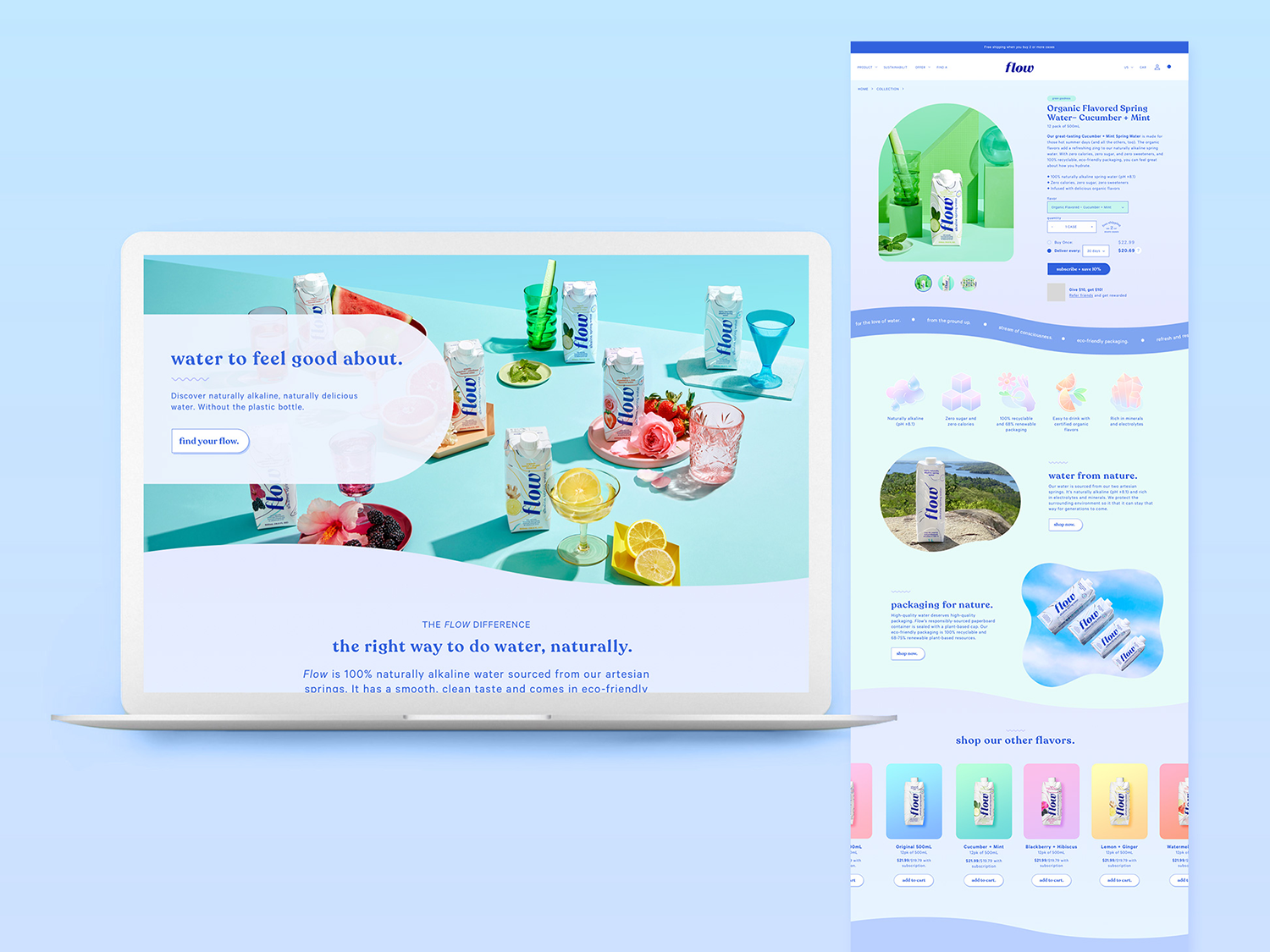
Preparing for a high-traffic surge from a summer celebrity campaign and an IPO meant ensuring Flow's website was seamless, scalable, and primed for conversion—it was also an opportunity to refine the brand’s identity.
Making the website flow.
Focus group feedback revealed Flow's opaque paperboard Tetra Pak was a larger barrier to consumers understanding that Flow was a water brand than we had originally thought. So, we shifted from bold colors and line art illustrations to fluid organic shapes, soft mesh gradients, and a more water-adjacent color palette of blues and periwinkles, with pastel versions of the flavor profiles as accents. We also incorporated more water splashes, pours, and waves, and leaned heavily into reflections, water texture, and sparkle in our photography.
Moving beyond aesthetics, we did an overhaul of collection pages to encourage product exploration and streamlined the item pages and checkout flows to increase speed to conversion.
The result was 300% growth overall, including a 5x increase in e-commerce sales .
The refresh extended into Flow’s trade show booths, with wavy colors, soft blues, and an Instagram worthy color-shifting neon rainbow to relax and have a drink under. It won the 2023 CHFA Exhibit Award for small booths.
role: Creative Director
team: Aidan O’Donohue, Surya Sivanandam (web), 60Grit (booth)
company: Flow Alkaline Spring Water


